library(lme4)

m0 <- lmer(MATH ~ 1 + (1 | CNTSCHID), data = pisa)Hands-on Null Model
Practice
Estimate null model
The first model created in multilevel modelling is the null model, which is a simple model with no predictors. By creating a null model we know how much variation we have at each level. The first step is to run the package lme4, then create the model using the lmer() function.
Null model result
To view the model results, we can run the summary() function and put the model m0 inside the bracket.
summary(m0)Linear mixed model fit by REML ['lmerMod']
Formula: MATH ~ 1 + (1 | CNTSCHID)
Data: pisa
REML criterion at convergence: 13681.5
Scaled residuals:
Min 1Q Median 3Q Max
-2.8568 -0.6436 -0.0624 0.6143 4.5990
Random effects:
Groups Name Variance Std.Dev.
CNTSCHID (Intercept) 2333 48.30
Residual 2012 44.86
Number of obs: 1297, groups: CNTSCHID, 41
Fixed effects:
Estimate Std. Error t value
(Intercept) 363.631 7.737 47Find ICC
Then we can find the ICC score manually by calculating the proportion of school variation divided by the sum of school variation and individual variation. Besides calculating manually, we can find the ICC score using the tab_model() function of package sjPlot.
library(sjPlot)

tab_model(m0)| MATH | |||
|---|---|---|---|
| Predictors | Estimates | CI | p |
| (Intercept) | 363.63 | 348.45 – 378.81 | <0.001 |
| Random Effects | |||
| σ2 | 2012.22 | ||
| τ00 CNTSCHID | 2332.65 | ||
| ICC | 0.54 | ||
| N CNTSCHID | 41 | ||
| Observations | 1297 | ||
| Marginal R2 / Conditional R2 | 0.000 / 0.537 | ||
Understanding ICC with Plot
Furthermore, to understand the meaning of school-level and individual-level variations, we can look at the graph across all schools. School-level variation comes from how different the lines (ESCS) are between schools. If the variation is low, the lines will be very similar. On the other hand, if the variation is large, then the lines will be very different. Individual-level variation is a summary of the differences between individuals (dots) and schools (lines).
The first step we take to graph the model for all schools is to predict the scores based on the model we created using the predict() function and save it as a new variable in our data.
pisa$m0 <- predict(m0)Null model plot
Second, create a graph showing the linear mean line for each school using ggplot() and the function geom_smooth(se = F, method = lm), to estimate the linear trend without confidence intervals.
pisa %>%
  ggplot(aes(ESCS, m0, color = CNTSCHID, group = CNTSCHID)) +
  geom_smooth(se = F, method = lm) +
  theme_bw() +
  theme(axis.text.x = element_blank(),
        axis.ticks = element_blank()) +
  labs(x = "", y = "Matematika", color = "CNTSCHID")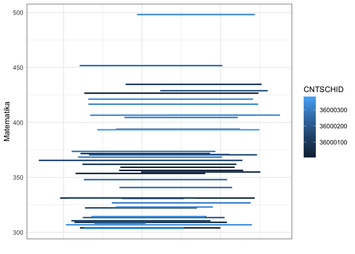
Plotting with qqmath
Beside using ggplot(), we can visualise the random effects using dotplot from lattice package using qqmath() and with random effect from the model using ranef().
library(lattice)

qqmath(ranef(m0, condVar = TRUE))
$CNTSCHID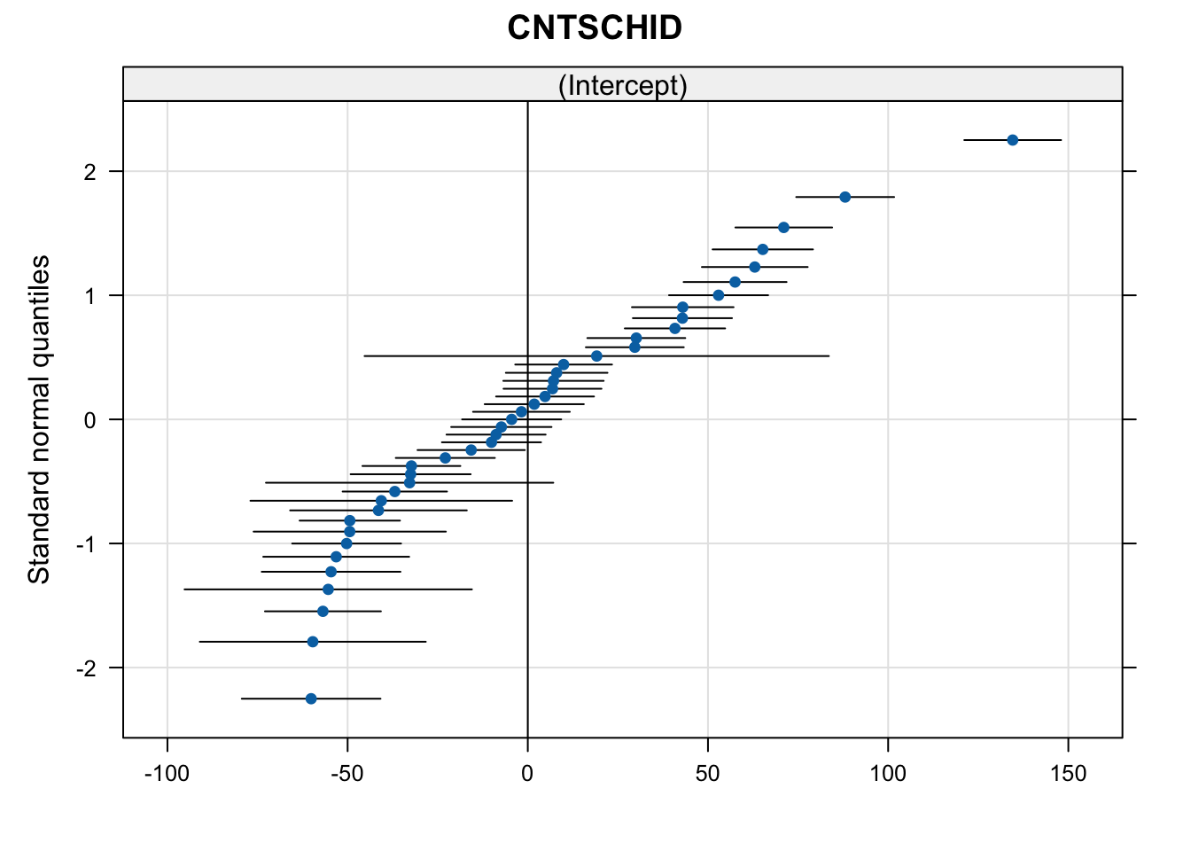
In the graph, each dot represents a school and the line represents a confidence interval. 0 is an intercept in \(x\) axis.